
📊 Sales Analysis Dashboard
A data analysis project to optimize digital sales and customer management at Distribuciones Rehobot.
Company: Distribuciones Rehobot
Tool: Power BI
Date: September 2025


🚀 Project Context
The company Distribuciones Rehobot is in a digital transformation process, migrating its sales model from face-to-face to online. The main objective is to reach 80% digital sales to:
Reduce operating costs.
Improve the management of overdue accounts.
Optimize service for the most valuable customers.
The data used for this analysis are real sales, customer, and product records, collected in Excel format since June 2025.
🎯 Dashboard Objective
The purpose of this project was to create an interactive dashboard in Power BI to serve as a key decision-making tool, allowing the company to:
Monitor the evolution of sales and the customer portfolio.
Identify high and low turnover products.
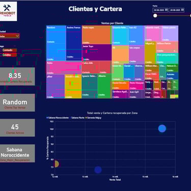
Detect strategic and at-risk customers.
Evaluate the efficiency of payment methods.

❓ Business Questions Answered
This dashboard answers crucial questions for the business operation:
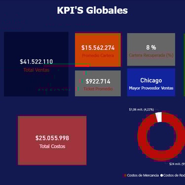
What is the evolution of sales and accounts receivable from June to date?
Which products are the best sellers and which have low turnover?
Which customers represent the largest proportion of revenue and debt?
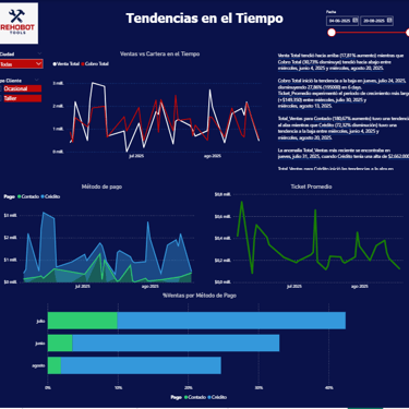
How do payment methods (cash vs. credit) behave over time?
📈 Key Visualizations
The dashboard includes the following strategic visualizations for a comprehensive view of the business:
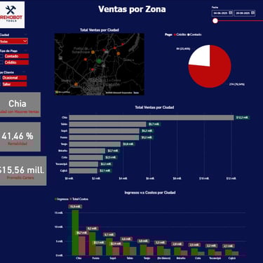
Total Sales and Temporal Evolution: Weekly and monthly trend charts.
Top Products and Turnover: Classification of products by sales volume and profitability.
Strategic Customers and Portfolio: Segmentation of compliant customers versus customers with overdue accounts.
Payment Methods: Comparison of cash vs. credit sales performance.
Sales and Portfolio by Zone: Maps or charts to obtain regional insights.


🛠️ Tools Used
Power BI: For visualization, data modeling, and dashboard creation.
Excel: The original data source (daily sales, customers, products, portfolio).
DAX: Used for creating custom measures and KPIs that drive the visualizations.
GitHub: Employed for technical documentation and as a project portfolio.
🧮 Main DAX Measures
Some of the key measures created in DAX for this project (you can find more details in the DAX_Measures folder):
Total Sales = SUM(Ventas_Diarias[Precio_Venta])
Average Ticket = DIVIDE([Total Sales], [Sales Quantity])
Unique Customers = DISTINCTCOUNT(Clientes[ID_Cliente])


🚀 Project Impact
This dashboard not only meets the initial objectives but also generates a significant impact by allowing the company to:
Make informed decisions regarding product and customer management.
Gain better control over the transition between digital and face-to-face sales.
Establish a clearer collection strategy thanks to the portfolio analysis.
Demonstrate skills in data analysis, Power BI modeling, and DAX application.